Dave & Jenny Marrs Partnership
Choosing an exterior color palette is about more than finding colors that look good together. It’s about deciding how you want your home to feel.
Warm and welcoming? Cozy and grounded? Bold and sophisticated?
The Dave & Jenny Marrs Curated Exterior Palettes take the guesswork out of bringing that vision together with coordinated siding, trim, windows and accents inspired by nature and designed to create a cohesive exterior.
Three palettes. Three distinct design directions. Which one feels most like home?

There’s a reason warmer neutrals continue to shape exterior design. They bring an inviting quality to the exterior while offering a timeless alternative to cooler grey tones.
Warm Welcome starts with Autumn Harvest siding for a warm foundation, then layers in Desert Sand trim and bright white windows to keep the exterior light and balanced. Dark Brown accents provide subtle contrast and definition.
The color story: Autumn Harvest + Desert Sand + White + Dark Brown
The design direction: Warm, inviting and inspired by the soft, natural tones of golden light.
Jenny says it best: “This palette wraps a home in warmth like golden light at the end of the day.”
Choose Warm Welcome if: You’re drawn to warm neutrals, classic curb appeal and an exterior that feels comfortable and inviting.

For a home that feels connected to its surroundings, look to the colors already found in nature.
Restful Ridge builds its exterior around Rugged Canyon, a rich, earthy siding color that brings warmth and depth. Linen trim provides a lighter contrast while Clay-toned windows and Dark Brown accents complete the grounded color story.
The color story: Rugged Canyon + Linen + Clay + Dark Brown
The design direction: Earthy, grounded and inspired by the warmth and character of a mountain retreat.
Jenny says it best: “These colors feel like a fireside evening — warm, cozy, and meant for gatherings.”
Choose Restful Ridge if: You gravitate toward earthy colors, Craftsman-inspired character and exteriors that feel naturally connected to the landscape.
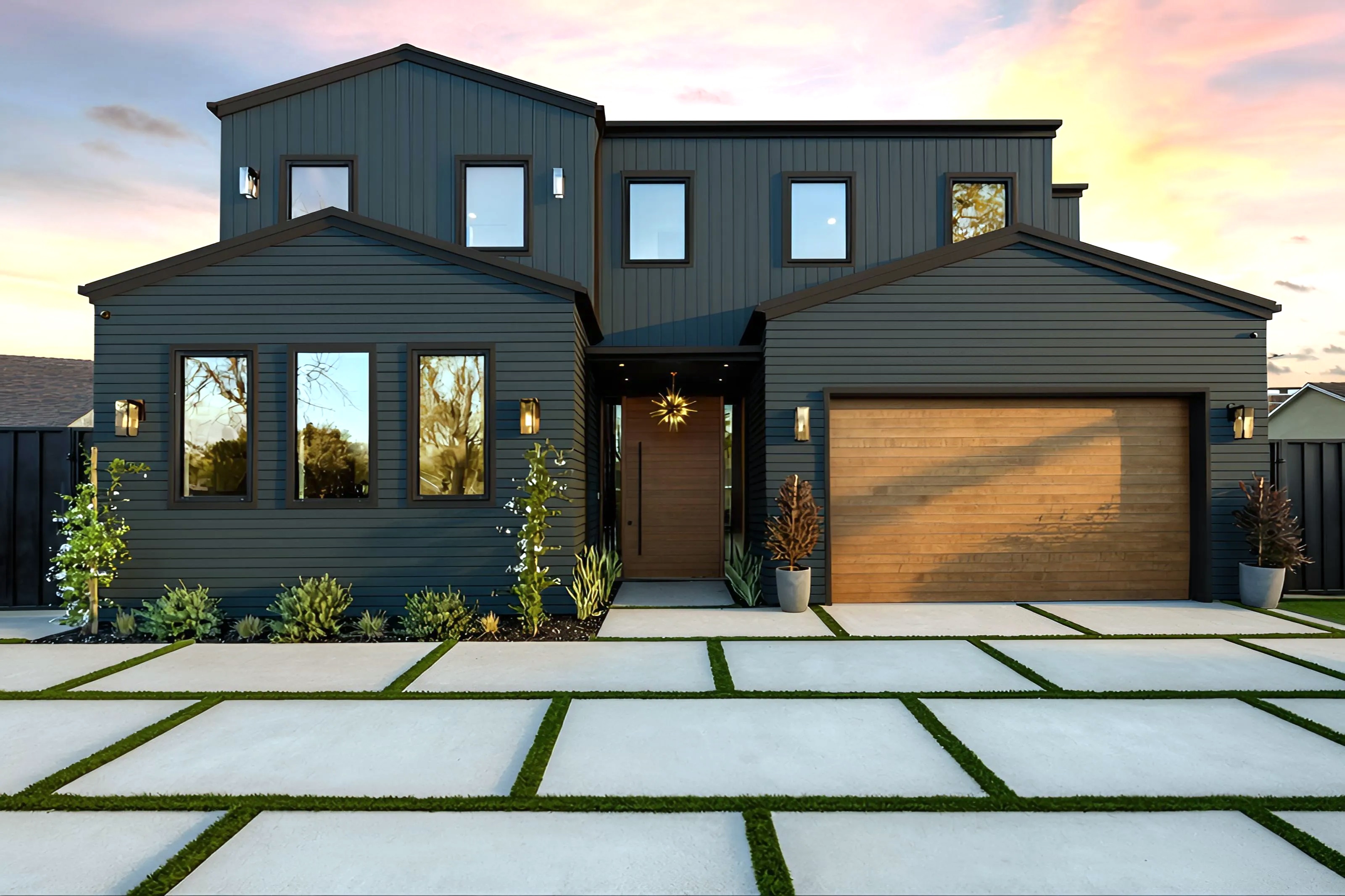
Going dark on the exterior doesn’t mean sacrificing timeless style.
Midnight Modern makes Rock Harbor the focal point, using the deep navy shade to create a rich backdrop that emphasizes the home’s architecture. Dark Bronze windows, trim and accents carry the deeper color story throughout the exterior for a polished, cohesive finish.
The color story: Rock Harbor + Dark Bronze
The design direction: Dramatic, refined and defined by sophisticated contrast.
Jenny says it best: “Deep navy gives instant architecture and frames the lines to let the details shine.”
Choose Midnight Modern if: You’re drawn to deeper exterior colors, strong architectural lines and a modern look that still feels timeless.
There isn’t one right approach to creating a beautiful exterior. The colors you choose can help shape the character of your home and create a look that feels distinctly your own.
You may be drawn to the welcoming warmth of Warm Welcome, the earthy character of Restful Ridge or the rich contrast of Midnight Modern.
Each takes a different approach to exterior color, but all three demonstrate how thoughtfully coordinated products and colors can create a home that feels balanced, intentional and beautifully pulled together.
Find Your Palette
Explore the full Dave & Jenny Marrs Curated Exterior Palettes Lookbook to discover all 12 color stories and find the combination that feels right for your home.
Then explore your favorites with the Mastic Home Design Visualizer. Experiment with siding, trim and accent combinations on a sample home or upload your own project to see how each palette can transform the exterior.
Find the colors that feel like home.
Whether you’re a homeowner looking for a professional to help with installation or a pro interested in purchasing Ply Gem brands and product lines, we’ve got you covered.